Sub draw_data()
Dim N As Long, i As Long
Dim x As Double, dx As Double
N = 100
x = 0
dx = 3.14 * 2 / N
' データ作成部
Application.ScreenUpdating = False
For i = 0 To N - 1
Sheet1.Cells(i + 1, 1).Value = x
Sheet1.Cells(i + 1, 2).Value = Sin(x)
Sheet1.Cells(i + 1, 3).Value = Cos(x)
x = x + dx
Next i
Application.ScreenUpdating = True
' グラフ削除
If Sheet1.ChartObjects.Count > 0 Then
For i = 1 To Sheet1.ChartObjects.Count
If Sheet1.ChartObjects(i).Name = "datagraph" Then ' "datagraph" という名前を指定して削除
Sheet1.ChartObjects(i).Delete
Exit For
End If
Next i
End If
' グラフ記入
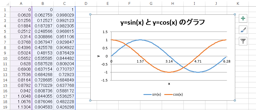
Sheet1.ChartObjects.Add(200, 20, 360, 215).Select ' 位置 (200,20) に 360x215 のサイズのグラフ追加
Selection.Name = "datagraph" ' グラフに名前をつける
ActiveChart.ChartType = xlXYScatterLinesNoMarkers ' 散布図のデータポイントなし
ActiveChart.SetSourceData Range(Cells(1, 1), Cells(N, 3)), xlColumns ' 離れた列は Union で Range を作成すれば良い
ActiveChart.Location xlLocationAsObject, "Sheet1"
ActiveChart.HasTitle = True
ActiveChart.ChartTitle.Characters.Text = "y=sin(x) と y=cos(x) のグラフ" ' グラフタイトル
ActiveChart.Axes(xlCategory, xlPrimary).HasTitle = True
ActiveChart.Axes(xlCategory, xlPrimary).AxisTitle.Characters.Text = "x" ' x 軸タイトル
ActiveChart.Axes(xlValue, xlPrimary).HasTitle = True
ActiveChart.Axes(xlValue, xlPrimary).AxisTitle.Characters.Text = "y" ' y 軸タイトル
ActiveChart.Axes(xlCategory, xlPrimary).MinimumScale = 0 ' x 軸の最小値
ActiveChart.Axes(xlCategory, xlPrimary).MaximumScale = 6.28 ' x 軸の最大値
ActiveChart.Axes(xlCategory, xlPrimary).MajorUnit = 1.57 ' x 軸の目盛幅
ActiveChart.SeriesCollection(1).Border.Weight = xlMedium ' sin(x) のグラフの太さ
ActiveChart.SeriesCollection(2).Border.Weight = xlMedium ' cos(x) のグラフの太さ(グラフ1本なら不要)
ActiveChart.HasLegend = True ' 凡例に関する設定
ActiveChart.Legend.Position = xlBottom
ActiveChart.SeriesCollection(1).Name = "sin(x)"
ActiveChart.SeriesCollection(2).Name = "cos(x)" ' (グラフ1本なら不要)
ActiveChart.Deselect
End Sub
|